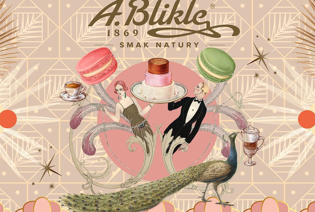
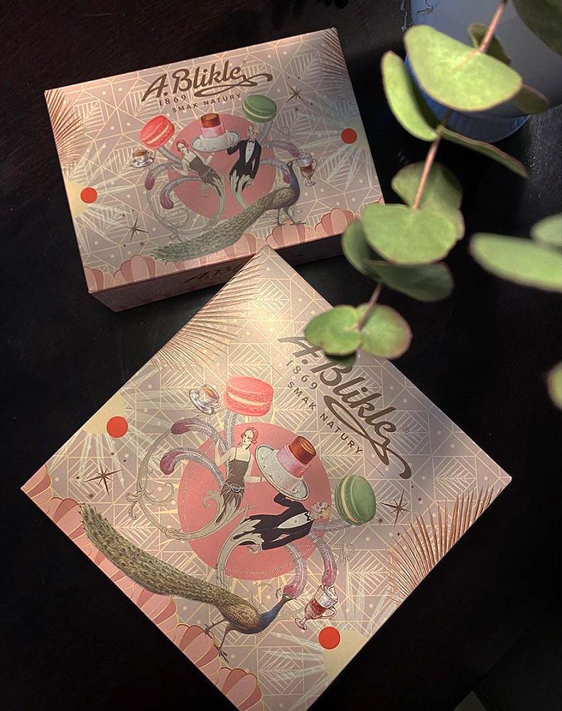
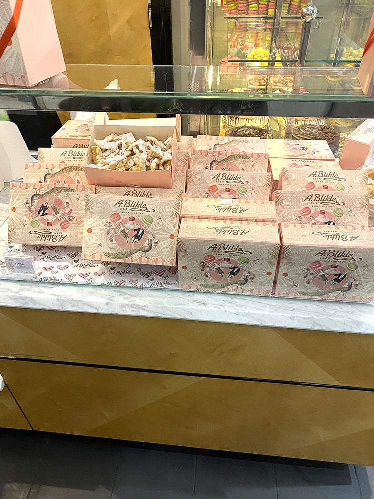
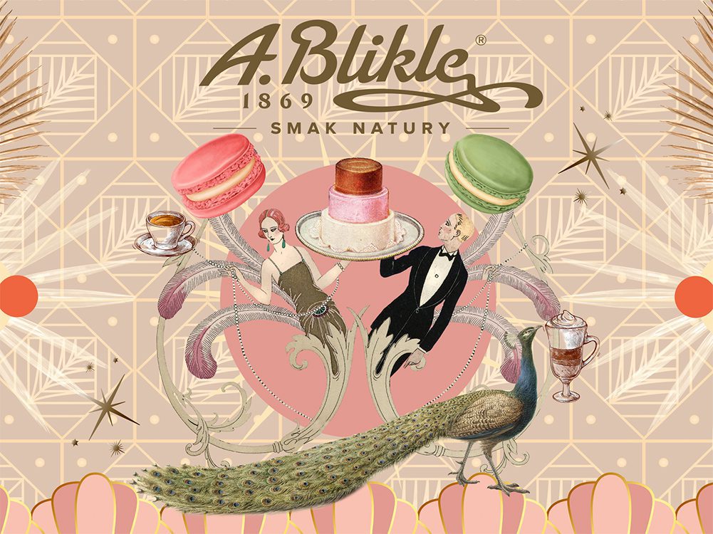
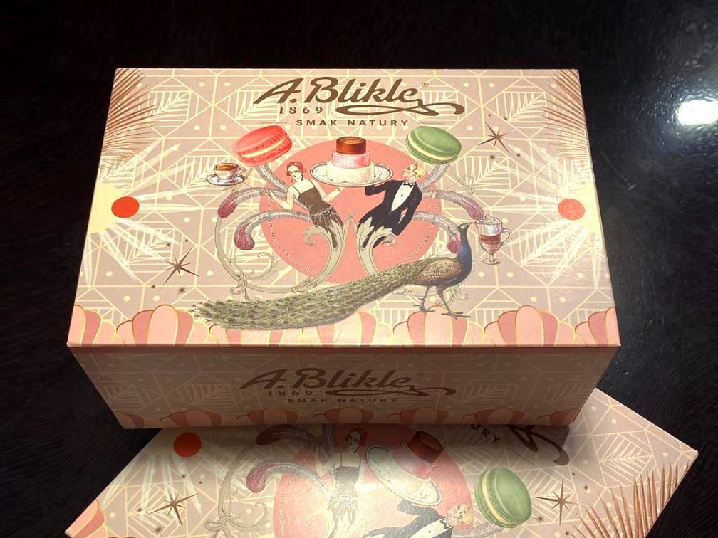
Aneta Klejnowska stworzyła nową interpretację marki A.Blikle 1869. Jej tradycja reprezentuje warszawskie marzenie i elegancję, która wyróżnia markę. Jej styl zawszy był wyrafinowany i autentyczny. Nowy projekt grafiki, który można od teraz zobaczyć m.in. na pudełkach w cukierni czerpie inspiracje z art deco. Premiera nowego wizerunku marki zbiegła się w czasie z odnowieniem lokali Blikle. Abyśmy czuli się elegancko przez cały rok, nie tylko w tłusty czwartek.
Aneta Klejnowska reimagined the A.Blikle 1869 branding. Its tradition represents the Warsaw dream and the elegance that distinguishes the company. Its style was always refined and authentic. You can see a new graphic design on boxes and branding materials. So that we feel elegant all year round, not only on Fat Thursday.
Aneta Klejnowska reimagined the A.Blikle 1869 branding. Its tradition represents the Warsaw dream and the elegance that distinguishes the company. Its style was always refined and authentic. You can see a new graphic design on boxes and branding materials. So that we feel elegant all year round, not only on Fat Thursday.


